
chubby makeup
showcase
Hello everyone and welcome to my showcase.
here you will see my own concept with its video and a concept I did for the level 5 students at university.
for my concept to the left, I wanted to choose something that I really enjoy looking into which was water...
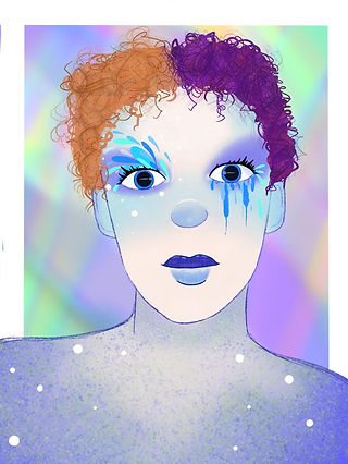
well, not just water but the elements. I chose water because I am a cancer sign and water is their element. here I looked into different colours and things that corresponded with that specific element. I took into consideration how I perceive water which in my opinion is very calming and therapeutic and to me, the colours of water are blue and white with hints of green. Others may see purples and blues or yellow and greens etc but I wanted to make it as personal to me as possible.
I then came up with my face chart below and wanted to make the left eye look like waves, and the right eye almost is like the stereotypical emotions tied to the cancer sign which can be seen as over-emotional or sensitive.
this was really fun to do and really allowed me to kind of be right in my element in a literal sense.
in the future, I may do the other elements and add them to my web page and other social media handles which can be found on the social media page at the top of the screen.


Level 5 concept


For the level 5 concept, me and the other level 4s were on a team meeting due to the ongoing pandemic and the level 5s pitched their ideas to us there was a variety to choose from but the one I like the most was from https://www.instagram.com/makeuppaije/
Paije asked each of us who wanted to roll with her concept to choose a colour from the rainbow here I chose purple as we can see above.
I really liked this idea as I thought it would push me to do something much more monochromatic which is something I struggle with. I am a very colourful person so sticking to one colour for me I knew would be a challenge.
so the way I had my thought process was with my own in mind. I wanted to create another kind of fluid water-like piece but in purple. this was the only specification I was given I had free reign to do what I wanted just as long as I stuck with the colour purple.
As we can see below I went with a really soft outcome which looks a lot like water or smoke depending on how you want to view it. this was actually really fun to create which I didn't expect me to find this fun as it is restricted to one colour family.
in my looks I really like to incorporate the artwork to go down the neck this adds more interest and is more in my field of work as I can be more on the creative side and use the majority of my own body as the canvas.
unfortunately, I would have had a video of this o youtube but after editing the final shots and uploading them the video corrupted and deleted so the only evidence I have here is my images and my mood boards.
i will gladly recreate this if anyone is interested in me doing so.
if you would like to see this please email me from the contacts page :)


